.svg)
Project overview
The product:
MovieMe is a mobile ticketing app where uses that easily book a movie ticket and make seat reservations. The target audience are movie lovers that want to easily book a movie ticket.
My responsibilities:
Conducting interviews, paper and digital wireframing, low and high fidelity prototyping, conducting usability studies, accounting for accessibility, iterating on designs.
Understanding the user
I conducted user interviews and created empathy maps to understand and empathize with the users I am designing for. A primary user group identified through research was middle age (21-40) working class individuals who no longer want to have to wait in lines for tickets.
This confirmed the initial assumptions about the users, but research showed that was not the only factor limiting users. Other user problems included the unavailability of sufficient data about a movie and the lack on an online payment system to book ahead of time.
1
Individuals want to easier book a ticket with few steps as much as possible.
2
Users wants up to date information about a movie. This includes trailers, ratings, cast information, revenue, budget, genre, etc.
3
Users want to be able to personalize their experience. This includes setting notifications for latest release based on genres and recommended movies areas.
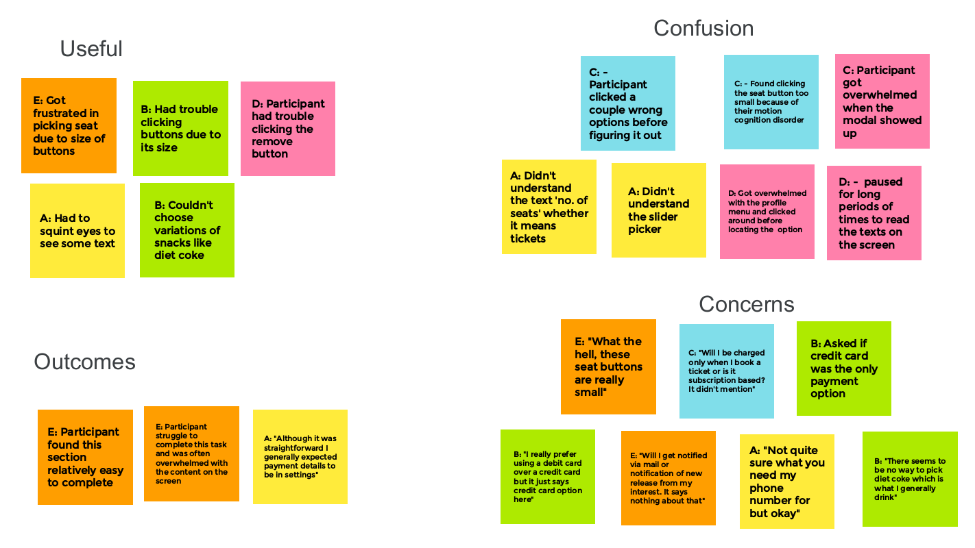
I used an affinity diagram to group data gathered from interviews in order to help me notice a pattern and pain points paramount to address.
Meet the users
Name: Kelvin
Education: Engineering Undergraduate
Occupation: Full time student
Kelvin is a extroverted engineering student. He enjoys hanging out with friends on the weekends to relax and take the edge off from all the studying. Kelvin is also impatient and hates waiting in line because he values his time and believes life should be made easy which is a motivation for studying engineering.

Name: Cynthia
Education: MBA in Business administration
Occupation: Business analyst
Cynthia is an independent workaholic. She is also very keen on numbers and figures as a basis for making decisions which comes in handy in her business profession. When she is not analyzing business risks she enjoys a good movie that she knows she will enjoy based on ratings, movie income and the strength of the cast.
Wireframing & Prototyping

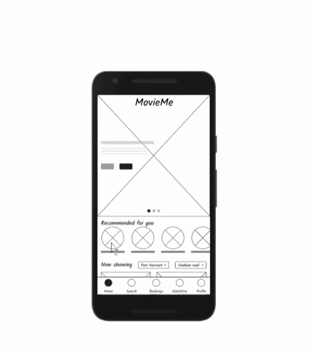
Usability studies and key insights
After a usability study was carried out on the low fidelity prototype, key insights was discovered document on the round 1 findings column.
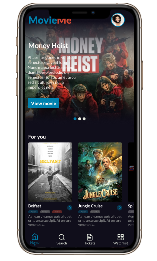
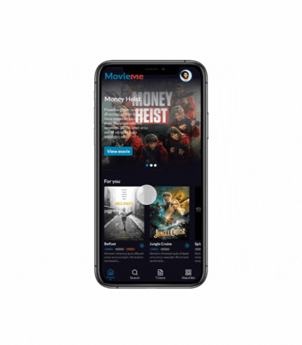
Final mockups and high fidelity prototypes

The impact:
“You did this? Wow”“Where can I download the app”“This is really nice”Some of the positive quotes from my peers concerning the design.
What I learned:
From the inception to the conclusion of this project, I have learned the techniques to ensure the user is put front and center of designs with user research and usability studies that were carried out.
Project overview
The product:
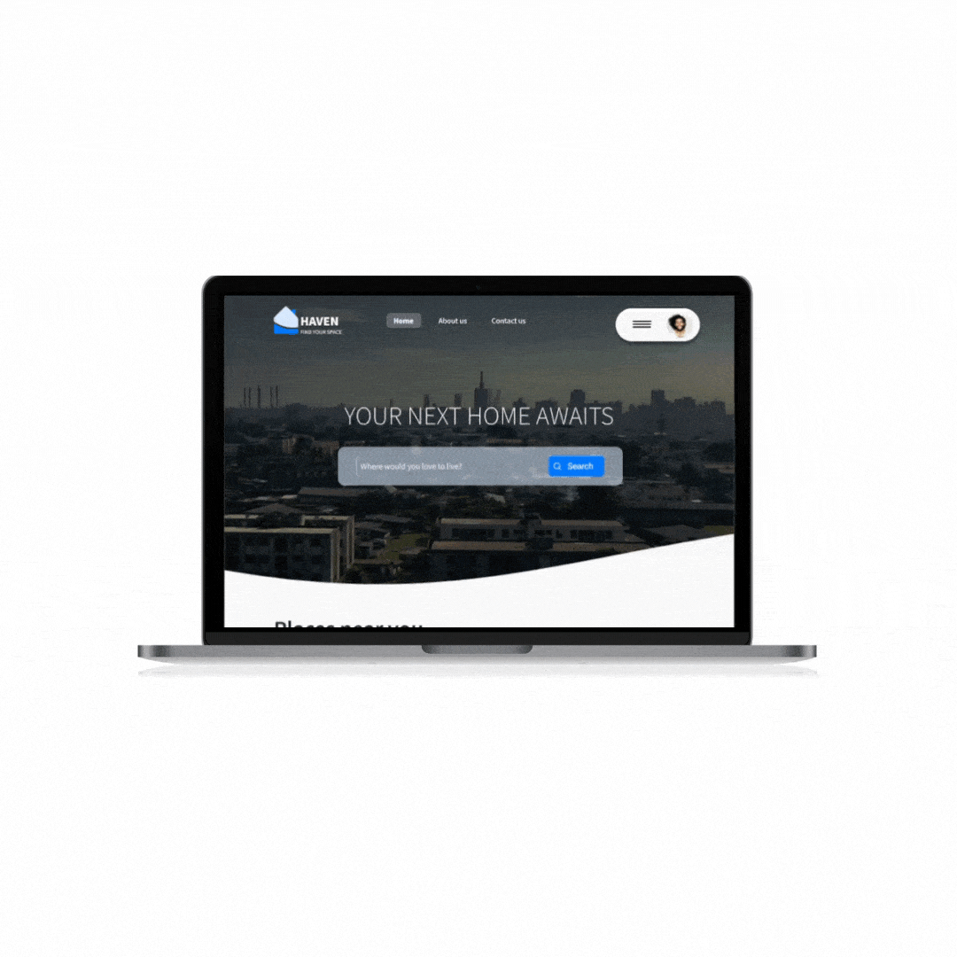
Haven is a website to easily help users find and reserve an apartment in their desired location.
My responsibilities:
Conducting interviews, paper and digital wireframing, low and high fidelity prototyping, conducting usability studies, accounting for accessibility, iterating on designs.
The problem:
Apartment scamming is a problem in Nigeria with on client protection after payment has been made.
The goal:
Design a responsive website to streamline the process of finding and reserving an apartment.
Understanding the user
I conducted user research through foundation techniques and user interviews to be able to understand the user painpoints. A key user group was working class individuals ranging from the age of 25-45.
A recurring problem some of the individuals I interview faced, was the problem of finding an to rent without so many trial and error. The current process involves physically visiting different apartments with agents and after several trails, settling on one that sometimes it not to the liking on the client.
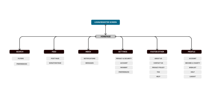
From research, users wanted a streamlined process to easily find and book apartments and so navigation is a big part of that, hence, a motivation to structure the sitemap as so.
.png)
Meet the user
Name: Kate Mensa
Education: MBA in Journalism
Occupation: Journalist
Kate Mensa is a top journalist who spends most of her time traveling and covering stories around the world. She often has to stay for extended periods of time and hotels might prove to costly or too uncomfortable and so she usually opts for apartments which isn’t always easy to find. She wants to be assured she’d get an apartment to her taste anytime and wherever her job takes her to.
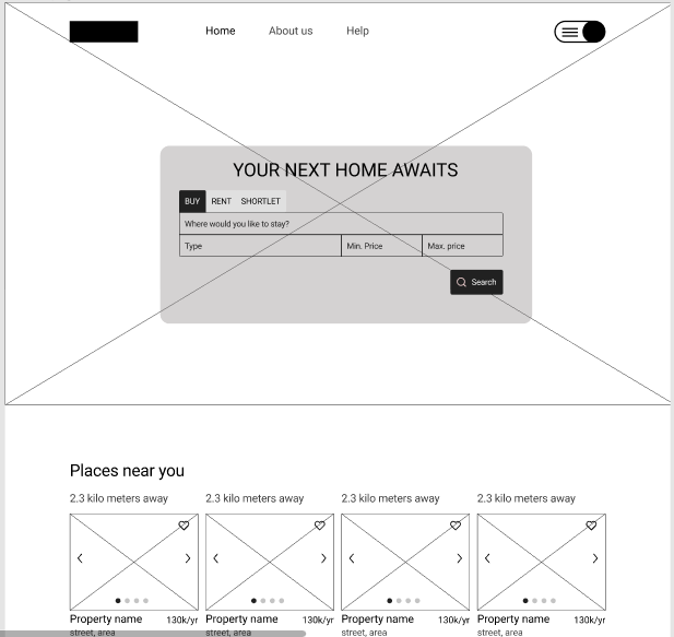
Wireframing & Prototyping
.gif)
Transitioning from paper wireframes to digital wireframes further grounded the design decisions I want to take.
It also made things ready for my to go into usability study on the wireframes.
Usability studies and key insights
After a usability study was carried out on the low fidelity prototype, key insights was discovered document on the round 1 findings column.
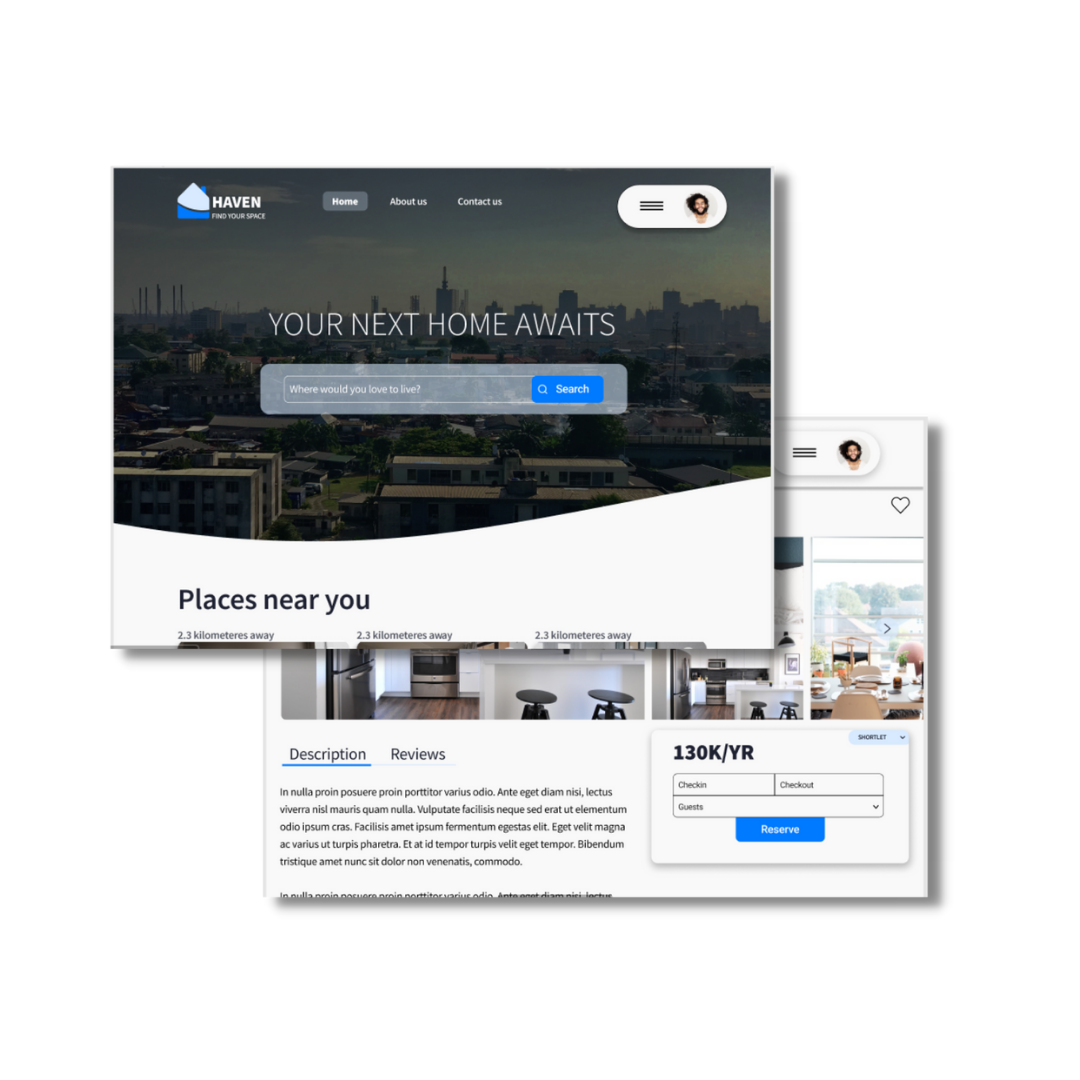
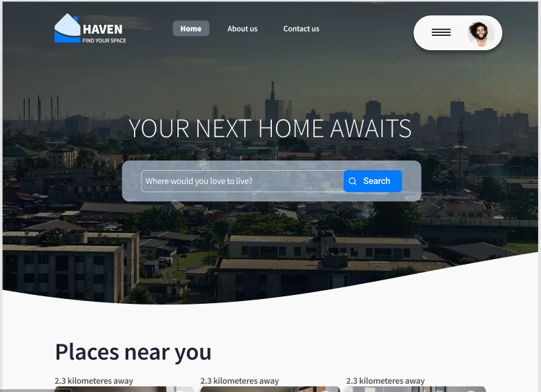
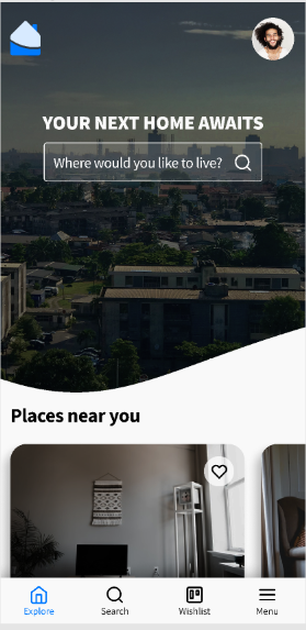
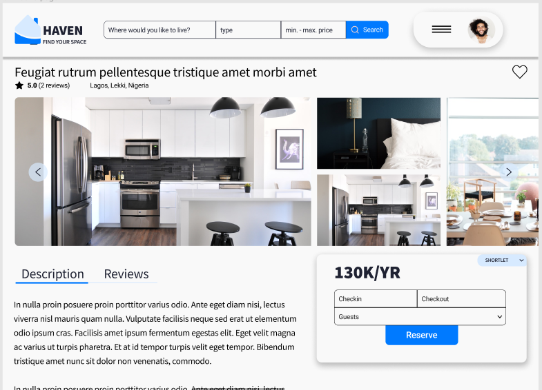
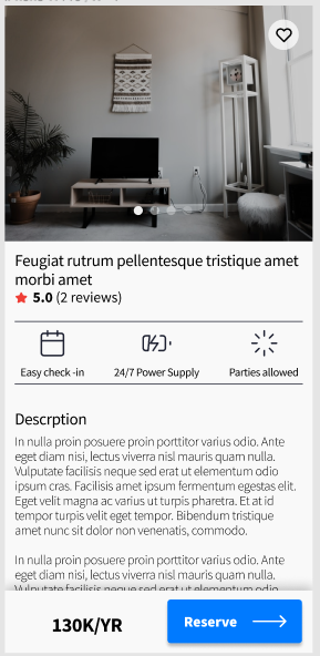
Final mockups and high fidelity prototypes
HOmepage
before usability study
HOmepage
after usability study
mobile view
product page
before usability study

product page
after usability study
mobile view
The impact:
Target users were impressive with the overall aesthetics on the designs and how easy it was to find and book an apartment.
What I learned:
I learned how research can easily play into designs and how important it is to test designs. Things can be overlooked but it could be that same thing that you will discover is important from research.
Project overview
The product:
Ginger is a social network between philanthropic organizations and philanthropists. It is a place for people to easily find non-profit organizations, charities, etc and support the cause. Primary target are middle age to advanced aged.
My responsibilities:
Conducting interviews, paper and digital wireframing, low and high fidelity prototyping, conducting usability studies, accounting for accessibility, iterating on designs.
The problem:
It is a common fear and excuse for people in Nigeria concerning the reason why charity donations are not rampat. They have no trust for these organization and believe they are just after their money. Ginger hopes to help with that by creating a social network for these organizations to meet their users and demanding these organizations be accountable for donation spendings.
The goal:
Design an app that will improve charity donations and the trust between users and philanthropic organizations.

Understanding the user
I conducted user research through foundation techniques and user interviews to be able to understand the user pain points. A key user group was working class individuals ranging from the age of 25-45.
The result of the user interviews further proved that users did not trust charity organizations because there was no way to actually verify the donations are put to use and is not actually been embezzled.
The sitemap acted a guide to ensure consistent design across platforms.
Meet the user
Name: Jamal Adams
Education: Graduate in finance
Occupation: Financial advisor
Jamal Adams is a financial advisor who needs a way to donate to organizations fighting wildfires because he was a victim of a wildfire growing up.
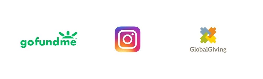
Competitive audit
A competitive audit on these competitors provided an idea of the direction to take the project and the opportunities to improve the user experience.
Wireframing & Prototyping

After the ideation phase was complete, I created paper wireframes and then digital wireframes based on the user research I conducted.
Usability studies and key insights
After a usability study was carried out on the low fidelity prototype, key insights were discovered.
High fidelity prototype
The impact:
Users gave the feedback that the app was promising with the way it creates a trusting experience for users to easy find and donate to causes they believe in.
What I learned:
I learned that the best way to deal with a big problem is to bring it down to smaller parts and deal with them one by one.
.gif)